The art of black and white photography
Underneath its colour, a photograph is a map of light and dark, and that map is what the eye uses to see shape. Black and white shows me the map on its own, which is how I find out whether a frame holds.
I get asked this a lot. The camera handles colour without any trouble, the sunset I’m looking at is orange, so why give that up on purpose?
For a long time my answer was some version of “I like the look”, which is true and explains nothing. The honest answer took me years, and it has two parts. The first is what a picture consists of once the colour is set aside. The second is a test I like to run on myself. Did I see something, or did the evening see it for me?
Table of contents
- What a photograph is made of
- What the painters knew
- Five things, and how they relate
- Waiting for the frame
- What keeps me at it
What a photograph is made of
Every point in a picture carries two pieces of information. One is how light or dark it is, which painters call its value. The other is which colour it is, which they call its hue. A red door at noon and the same door at dusk have the same hue and very different values, and that difference, light against dark, is what tells you the time of day and where the sun is.
The eye treats the two very differently, and this is the part that took me longest to understand. Shape, edges, depth and texture are all read from the value layer. The colour layer is read separately, on top, and at a much coarser grain. Television has relied on this for decades, and so does every JPEG on your phone, where the colour is stored at a fraction of the resolution of the brightness, and nobody can see the difference, because the eye was never reading shape from colour in the first place.
So when the colour comes out of a photograph, what stays is the layer the eye uses to see form, and what goes is a layer that carries mood and information. Warm light says evening, a red coat says look here, a blue sky says calm, and all of that is real work that colour does. A colour photograph done well composes with it. Black and white takes that layer away and asks the value layer to hold the picture by itself, meaning the way the light is shaped, where the dark sits against the bright, how the things in the frame are placed against each other, and the feel of a surface.
That is why taking the colour out is a test. If the frame still works without its mood layer, the light and the shapes were doing the work. If it falls apart, they weren’t, and the mood was holding it up. Both results are useful to know. The second one stings, and the second one taught me most of what I know about building a frame.
What the painters knew
None of this is new. Painters worked it out long before there were cameras, because a painter has to build light out of pigment, and the ones who did it best are still the clearest teachers I know.
Chiaroscuro is the Italian word for it, light-dark, and it means using a strong difference between the lit side and the shadowed side of things, so that a painted figure gets solidity and weight. A ball under a lamp reads as round because one side is bright and the other falls into shadow, and the same ball drawn in flat light is a circle. That is chiaroscuro in one object. Pushed further, until the dark takes over and one beam of light does all the work, it gets its own name, tenebrism, from the Italian word for dark, and the painter who took it furthest was Caravaggio.
The room in “The Calling of Saint Matthew” is nearly black. A group of men sit at a table and most of them are hardly there. Then a single shaft of light comes in from the right, lands on a hand and on a few faces, and everything the painting has to say happens where that light falls. Nothing pulls the eye away, because nothing else has been given any light. That is the frame I’m looking for when I let everything outside a single spotlight go dark, the way “Held Note” and “The Weight” in the archive do, and it is this essay’s point made four centuries before the camera, which is to keep less, so that what stays carries everything.

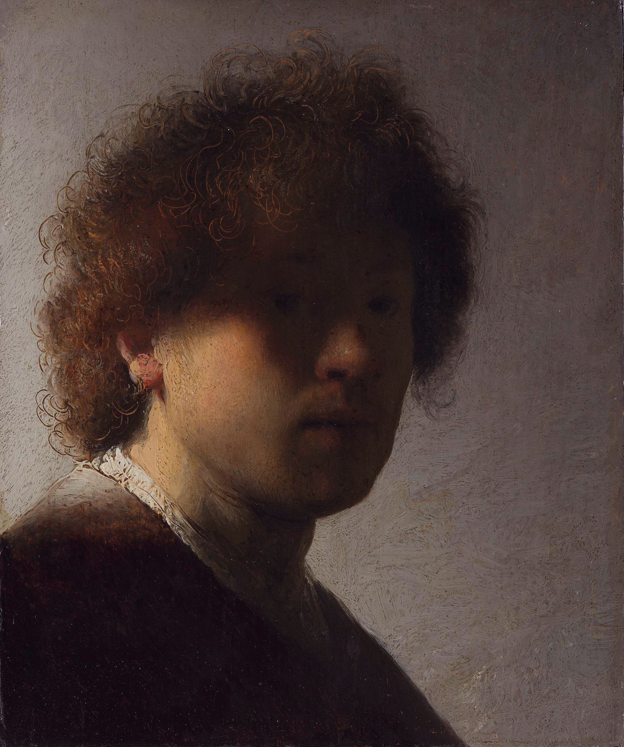
Rembrandt uses the same tools with the volume turned down, and I find him the harder of the two to learn from. His dark is not a wall. You can half see into it, and something is going on in there that you can’t quite make out, so the shadow has depth to it instead of being an absence. In the small early self-portrait the light catches the hair and one edge of the face, and the rest of the face is there, in the dark, if you look for it. That is contrast held back rather than turned up, and holding back is the harder skill, because how much to keep has to be decided at every point in the picture. When I’m choosing how far a shadow goes in a frame of my own, whether a face is let go to solid black or keeps a trace of itself, it is usually his instinct I’m reaching for, even when the result ends up looking more like Caravaggio.
Vermeer barely uses the drama at all and still belongs here, because he cares about the thing next door to it, which is what one light does when it crosses different surfaces. “Girl with a Pearl Earring” has its light from one side, the upper left, and that one light does something different on skin, on cloth and on the pearl, soft on the first, flatter on the second, and a single sharp point on the third. That is a photography lesson as much as a painting one. The difference between a dead frame and a live one is usually whether you noticed where the light came from, and the subject matters less than you’d think. The morning light on the dough, the steam and the basket in “Hearth” is one light doing three different things, which is the closest I’ve come to what he was after.

India had worked this out even earlier. The old Indian treatise on painting, written down over a thousand years ago, lists what a picture is made of as line, shading, ornament and colour, and it grades a painting by its shading. A picture with no shading is middling, one shaded in some parts and not in others is bad, and one shaded all the way through is good. It also says who looks at what. The masters praise the line, the connoisseurs praise the play of light and shade, and the rest of us like the richness of the colours. I read that as a description of what you learn to see as you go on looking. Nobody is being told to stop liking the colours.
Five things, and how they relate
With the colour gone, what a monochrome frame has to work with comes down to five things, which are light, shadow, line, texture and contrast, and that is the whole of it. Every choice in the frame is a choice about how those five sit with each other, since nothing else is available.
Light comes first, with its shadow, and by light I mean its character, and not only how much of it there is. Hard midday sun makes sharp-edged shapes and black shadows, which is graphic and a little brutal. Soft early-morning light makes long, gentle transitions from bright to dark, which painters call gradients, and which give a face or a wall its roundness. In colour, that difference gets folded into whether the picture feels warm or cool. In black and white it is the entire picture, which is why the time of day decides more than the subject does.
Contrast is the distance between the darkest and the brightest parts of the frame, and it is what makes a picture feel deep. With too little you get a flat grey picture, technically correct and lifeless. Too much and the detail disappears, into solid black on one side and blown-out white on the other. A useful way to think about it comes from the photographers who worked in monochrome a century ago. They divided the range from pure black to pure white into eleven steps, with middle grey at the centre, and learnt to place the parts of a scene on that scale before pressing the shutter, a face a step above the middle and a deep shadow near the bottom, so that the print would have the range the picture needed. I don’t use the numbers, but the habit of deciding where each thing will sit between black and white before the shot is the useful part, and it is the same decision Caravaggio and Rembrandt made with a brush.
Line and geometry carry more here than they do in colour. Hue can no longer tell one thing from the next, so shape has to do the telling. A diagonal that leads the eye across the picture, a row of windows or railings that repeat, and the empty space around one figure, which photographers call negative space, all end up holding the picture up. In “Still Water” the diagonal is the band of morning light across the lake and the duck sits at its edge, and if you take the diagonal away there is no picture.
Texture is the last of the five, and it is where I once had a question I couldn’t answer. Grain on a wall, ripples on water and the weave of cloth all read with a clarity in black and white that colour seems to smooth over, and I used to wonder whether losing colour somehow sharpened my attention to surfaces or whether I had made that up. The answer was in the first section. Texture is a pattern of light and dark at a fine grain, and fine detail is read from the value layer at full resolution, so colour never carried it. Taking the colour away only removes what was sitting on top of it.
Waiting for the frame
Most of what a black and white photograph is going to be is settled before the shutter is pressed, while I stand and watch a scene for the moment when the light and the shapes agree.
Explaining this to someone who has never tried it is hard, because seen from outside it is a man standing on a corner with nothing to do. The corner, most of the time, isn’t a picture. The light is flat, the people are spread about at random, and no part of the frame has anything to do with any other part. Then, for a minute or two, it resolves. A person crosses at the right speed, the sun gets low enough for the shadows to take a shape, a slot between two buildings puts one beam of light exactly where someone has stopped to stand. That minute is the photograph, and everything before it was the work.
A photographer who wrote the book on this called it the decisive moment, the fraction of a second in which the scene offers you a composition, and his warning was that once you miss it, it is gone for good. In black and white you feel that more, because there is no mood layer left to rescue a frame that was almost right. Either the five things fall into an arrangement that holds, or you have a grey picture of not very much.
This is also why I don’t shoot the way a phone invites you to, which is constantly, with the choosing left for later. When a frame costs nothing, volume quietly takes over the job a decision should be doing, and the decision is the part I’m there for. I would rather stand for a long time and press the shutter once.
What keeps me at it
I don’t hold that black and white is a superior way of seeing, and an essay like this can read as if I did. Colour photography, done well, is a discipline of its own with a rigour of its own, where the colours themselves have to be composed the way I compose light and dark, and I haven’t given it the years it would take to see that way. What I do think, for myself, is that black and white gives me the quickest test I have. Did I see something, or did the evening see it for me?
The frames I keep are the ones that still stand when the colour is gone, where I can say what is holding them up, because nothing in them is left unexplained. The bar is high, and I fail it more often than I clear it. The ones that pass are the only pictures I’m certain I made myself, as opposed to pictures a good evening made while I stood there with a camera. What I’m after is a symphony of lights and shadows, and the geometry is what holds each frame together.